The Analysis Cross-Matrix: A New or Useful Approach?
Published: 6 October 2015
I want to present an idea I had for a business analysis artifact that I am currently calling an Analysis Cross-Matrix. I don’t know if it’s original, although I haven't seen it anywhere else. I don’t even know if it might be particularly useful, or if there are existing techniques that can do the same thing better. That’s why I am posting this article. I want feedback. But so far it seems potentially useful and the initial feedback I’ve gotten from a few co-workers was mostly positive.
The idea originated when I came across an example of a Hoshin Kanri X-Matrix and combined it with some of the concepts from the Business Analysis Core Concept Model.
I took the main cross-matrix structure from Hoshin Kanri but changed the arms of the cross to represent information about Stakeholders, Needs, Changes, and Solutions. These represent the Who, Why, What, and How of any initiative. And depending on how you populate the cells of the matrix, we can add the When dimension as well.
The basic unpopulated matrix looks like the sample below. You can select whatever colors you prefer, of course.
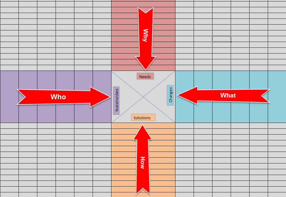
The matrix is intended to be read in a clock-wise manner starting with the Stakeholder arm (at 9 o’clock). Essentially, the structure is that Stakeholders have Needs, Needs drive the definition of Changes, Changes are realized via Solutions, and Solutions impact Stakeholders.
The arms
are populated with information about the specified subjects, at whatever level of detail is most appropriate for the situation you are in. But the following are the guidelines I have come up with so far:
- Stakeholders can be individuals, teams, or whole departments; depending on what level of analysis you want to represent.
Needs
can be goals, objectives, problems, or other drivers of Change. The key thing here is that Needs should drive Change, not specify Change.- Changes can best be thought of as high-level requirements (at the technology, process, or capability level). Or if you are working on a small effort, they might be your user stories or functional requirements. As always, they should be solution agnostic and at the level of information you want to represent.
- Solutions should indicate how a change will be realized. They are generally represented here by specific software applications or components; or specific changes being made to processes, organization, or capabilities.
Where a stakeholder has a need, the cell in the matrix where they cross is filled in. And the same idea is repeated for Needs and Changes, Changes and Solutions, and Solutions and Stakeholders. In the example below I have used solid black to represent a primary need, and solid grey to represent a secondary need. But you could use other colors to represent different types of needs, different priorities, etc.
You likely won’t have enough information to fully populate the matrix when you initially create it (although that depends on when in the project lifecycle you are creating it), and the level of detail the entries in the “arms” represent may change based on the current state of the initiative.
If you are starting a project, the idea is that the Stakeholder arm would be (mostly) populated first; with the Needs arm populated shortly after or at the same time. However, the main idea is for this to be a big picture view
of an effort, and not too detailed.
As a completed
example of my idea, I have included the matrix below. Click on the image for a larger view.

Please note that the matrix above is simplified (they could get bigger very easily); completely made up off the top of my head; and may not be completely logical if you know anything about the Solutions listed. I just picked a few solutions I was looking at on the web or was already familiar with.
So the final discussion point is, What is this useful for?
- As a high-level summary of a project or other change effort, to be used by the project team.
- As a gap-identification tool for the business analyst to help ensure that all identified Needs are being met, all specified Changes are being implemented by a Solution, and which Stakeholders are impacted by a Solution and who thus strongly factor into change management efforts.
And conversely, What might it NOT be useful for?
- It seems too complicated and
busy
to be used for providing a project summary to senior management or similar stakeholders. - Detailed traceability, especially at the Change and Solution quadrants.
So that wraps up the overview of my idea. Do you have any comments or feedback? Please let me know.
Thank you.